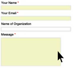
In your website, you should have a page called “Contact Us” or “Contact Our Company”. It lists out all the contact information of your company, likes Address, Email, Phone, Fax. But, do you have a contact form for customers to make their enquiry directly from the webpage?
It is important to have a contact form for customers to contact your company. Customers fill the form and click the submit button, their enquiry/comment can deliver to your company. They don’t need to to open their email program or leave their computer to make a phone call. The contact form can greatly encourage customers to contact your company.
A contact form can encourage customer to make enquiry. But, a poor design form will only stop customer from using it.
Here are the tips for a good contact form.
Title
State clearly the title of the contact form and separate the contact form from other elements in the page.
Instruction
An instruction should be given at the top of the form. This is especially important if your have a complicated form.
Submit/Cancel Button
Submit and Cancel button should be placed at the bottom of the form. It is common and standard to put them at the bottom. If you want to put them some place else, think again and ensure the customers know where is your buttons.
Label All Fields
Label should be given on the left or top of the fields.
Require/Optional Fields
State clear which fields are required. These can help customer to fill the form easily.
But, don’t use too many required fields without explanation as it will hurt customer’s trust.
– Use an asterisk and the word “required” to mark them
– Make the background color of the fields different
– Group the required fields together into one section.
Default Option
For those multiple choice question, default option can helps customer to fill the form.
Avoid Large Number of Fields
Keep the form as simple as possible. No one is willing to spend time to fill in web form. Remember that the form is to provide a quick and easy way to contact your company.
Better Organization for Long Form
If you have a long form, you may consider to group the fields into different section with sub-heading. Another workaround is to split the form into multiple page.
No Duplicate Information
Don’t ask customer to fill the same information twice, especially in multiple page form.
Error Message
For any input error, you should provide short and clear message where is the problem.
It is better if you can validate all the form fields and show the error message in one dialog.
It is really annoying if there are three validation popup for three input errors.
After Submission
After form submission, the page should state the form is submitted and what the customer will expect.
– Will they receive email acknowledgement?
– When they will receive a reply?


haha, people treat web contact form just like posting a phone number and don’t expect any result. but, a good web-contact form really encourage visitor to make enquiry and it can provide much better result than the phone.